


Most people who lose money in crypto do not lose it because they picked the wrong coin. They lost it because they had no idea what the chart was telling them before they bought it.
Bitcoin reached an all-time high of around $126,000 in October 2025, then shed more than 55% by mid-2026, a brutal correction that wiped out traders who bought without any chart context.
Learning to read a crypto chart is not about becoming a Wall Street analyst. It is about developing enough pattern recognition to make informed decisions instead of emotional ones.
1. Understanding Candlestick Charts
The most common chart type in crypto is the candlestick chart. Each candle represents price movement over a chosen period of time and shows four data points: the open price, the close price, the high, and the low.
A green (or white) candle means the price closed higher than it opened — buyers were in control.
A red (or black) candle means the price closed lower than it opened — sellers dominated.
The thin lines above and below the candle body are called wicks or shadows.
A long upper wick on Bitcoin, for example, suggests that bulls pushed the price up aggressively but sellers rejected it, a sign of potential resistance at that level.
A long lower wick signals the opposite: bears tried to push the price down, but buyers absorbed the sell pressure and closed the candle far from the low.
2. Choosing the Right Timeframe
Timeframes filter the noise. A 1-minute chart looks chaotic on any coin; a daily chart shows a clean trend. As a beginner, these three timeframes will carry you furthest:
- Daily chart (1D): Best for spotting the overall trend direction and major support/resistance zones
- 4-hour chart (4H): Great for identifying entry and exit zones once the daily gives a direction
- 1-hour chart (1H): Used to refine entries once the 4H provides a setup
Pro Tip: Always start with a higher timeframe. If Bitcoin is in a downtrend on the daily chart, avoid looking for long (buy) setups on the 15-minute chart. Trade in the direction of the bigger picture, not against it.
3. Reading Market Structure
Market structure tells you whether the market is trending or ranging. A healthy uptrend makes higher highs and higher lows — each peak is above the last, and each pullback holds above the previous low. A downtrend makes lower highs and lower lows.
Bitcoin is a simple example of both. In 2024-2025, BTC rallied from around $60,000 to a high of $126,000, forming a sequence of higher highs and higher lows throughout the period.
Traders who recognized this uptrend structure bought the dips instead of panicking during corrections.
By 2026, however, with BTC trading below all its major moving averages and forming lower highs since its October 2025 all-time high of $126,200, that same structure had flipped bearish. Bitcoin has dipped to $60,001 in February and $59,200 in June 2026, essentially lower lows.
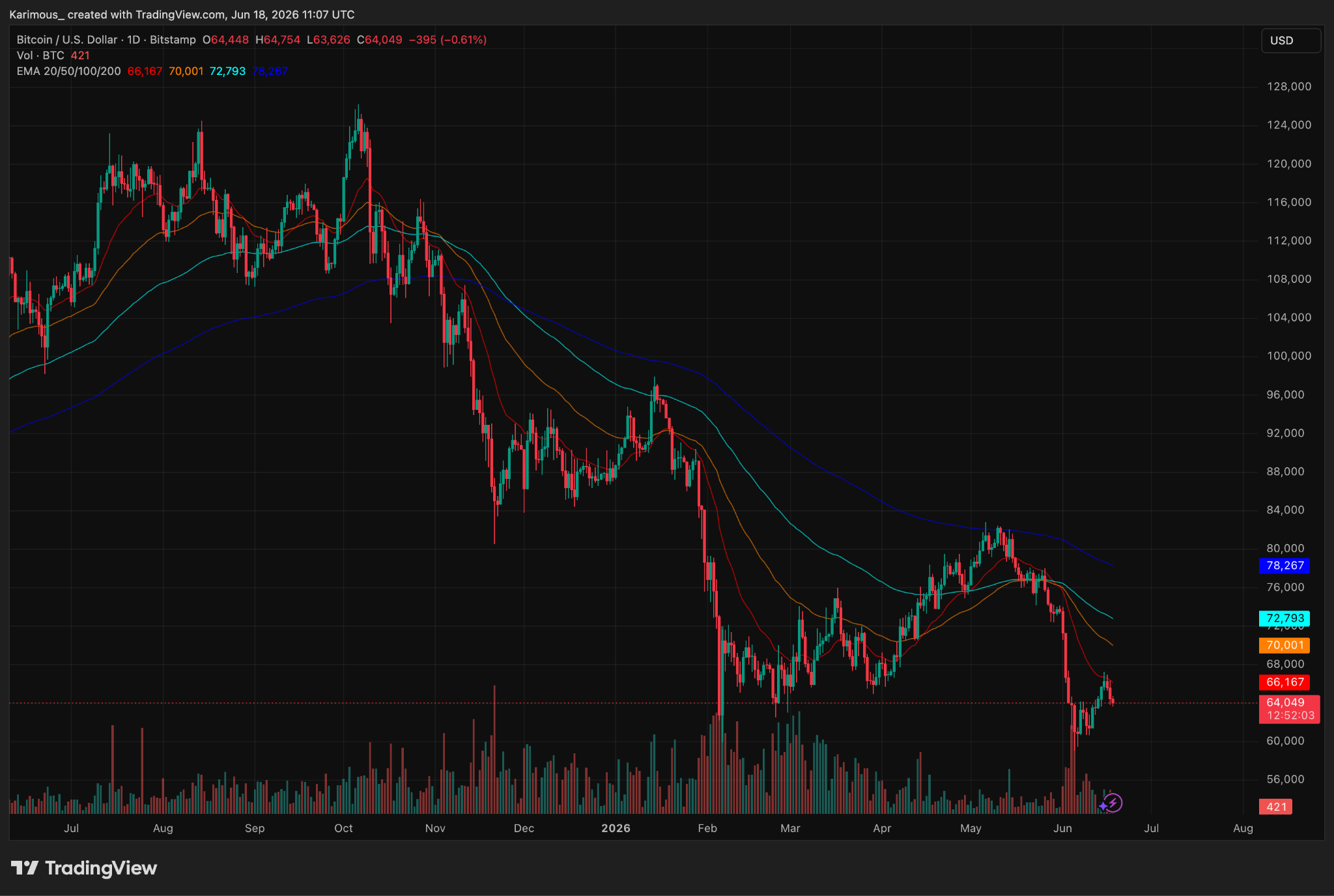
When a market starts making lower highs even while briefly touching new price peaks, that divergence in structure is often the first warning of a trend reversal.
4. Support and Resistance Levels
Support is a price level where buyers have previously stepped in strongly enough to stop a decline. Resistance is a level where sellers have repeatedly pushed the price back down. These levels form because traders have memory — the same prices that caused reactions in the past tend to cause reactions again.
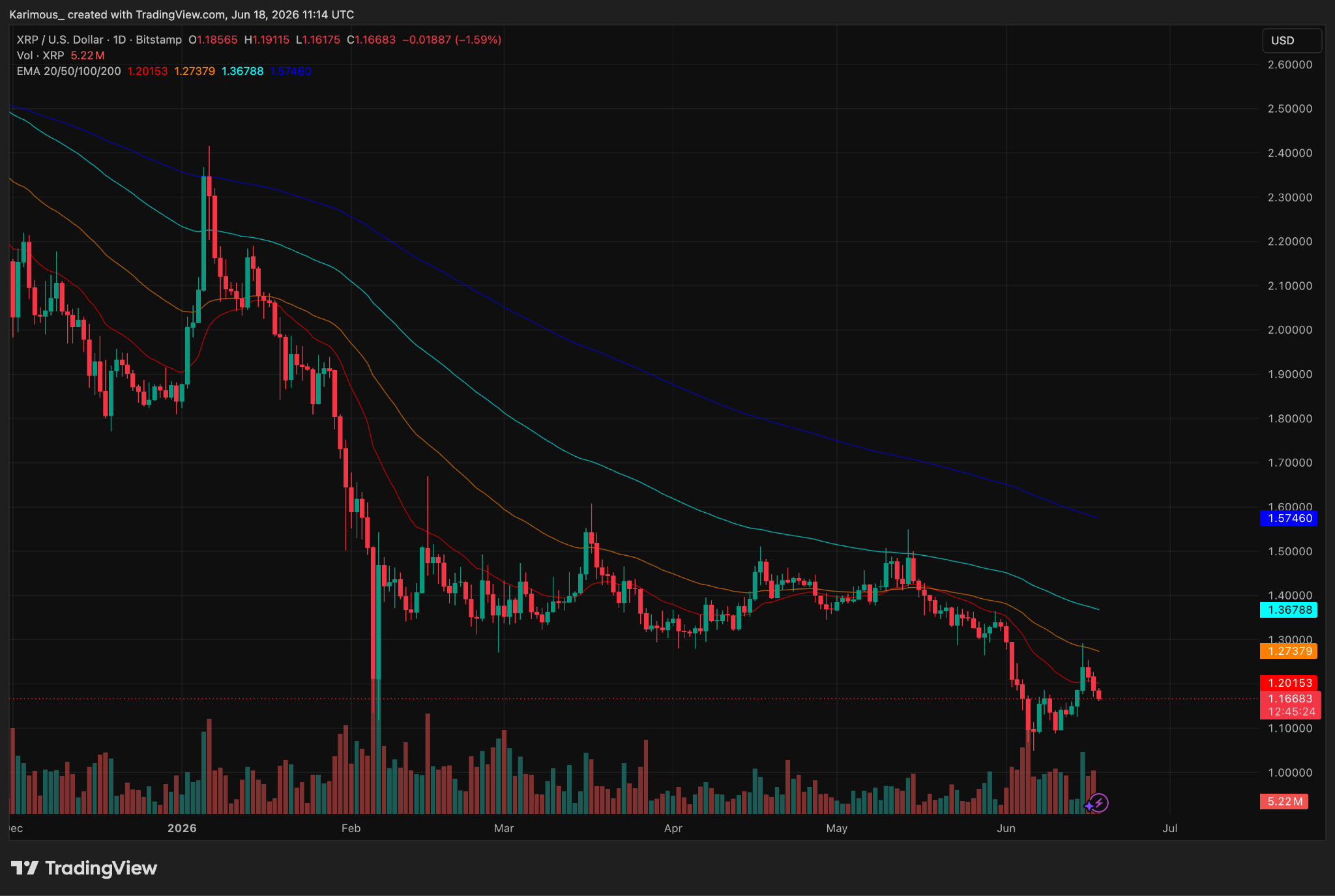
XRP offers a real-world example. After surging from under $0.50 to a cycle high of $3.66 in mid 2025, XRP spent months finding resistance near the $2.00 psychological level before its big decline.
As price fell through $2.00 and later through $1.30, each previously broken support became a new resistance ceiling — a classic role reversal. As of June 2026, the $1.28 to $1.30 zone remains a key battleground, with the 50-day EMA sitting at approximately $1.28.
To draw support and resistance levels, look for areas where price has reversed or consolidated multiple times. The more touches a level has across different time periods, the more significant it becomes.
5. Volume Analysis
Price without volume is just noise. Volume confirms whether a move is genuine or a fake-out. A breakout above resistance on high volume is far more reliable than one on thin, low-volume trading.
Watch for these volume signals:
- Rising price + rising volume: Strong, confirmed uptrend as buyers have real conviction
- Rising price + falling volume: Warning sign. The move may be running out of steam
- Price drop + volume spike: Potential capitulation or selling climax, often a sign the move is exhausting
Common Mistake: Ignoring volume when evaluating breakouts. Many retail traders buy breakouts that fail simply because there was no volume conviction behind the move. A price break without volume is a signal to wait, not to act.
6. Chart Patterns to Know
Certain price formations repeat themselves across markets and timeframes.
Head and Shoulders: A reversal pattern with three peaks, the middle being the tallest. When the neckline — the support connecting the two troughs — breaks on volume, it signals a trend reversal from bullish to bearish.
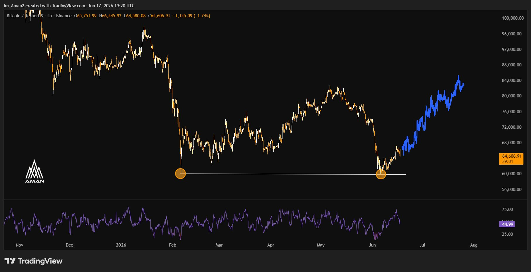
Double Bottom: Two roughly equal lows followed by a breakout above the neckline. This is a bullish reversal signal. Currently, many analysts have flagged Bitcoin’s double bottom formation around the $60,000 support zone, with a projected target toward $84,000.
Source: X
Bull Flag: A sharp upward move followed by a brief consolidation in a downward-sloping channel. The breakout from the flag typically targets a move roughly equal to the height of the original flagpole. This pattern appears frequently in Bitcoin and large-cap altcoins during trending markets.
7. RSI: Measuring Momentum
The Relative Strength Index (RSI) is a momentum oscillator ranging from 0 to 100 that measures the speed and strength of recent price changes.
- RSI above 70: Overbought, and the price is due for a pullback or consolidation
- RSI below 30: Oversold, selling pressure is exhausted, potential for a bounce
- RSI divergence: When price makes a new high but RSI makes a lower high, it signals weakening momentum.
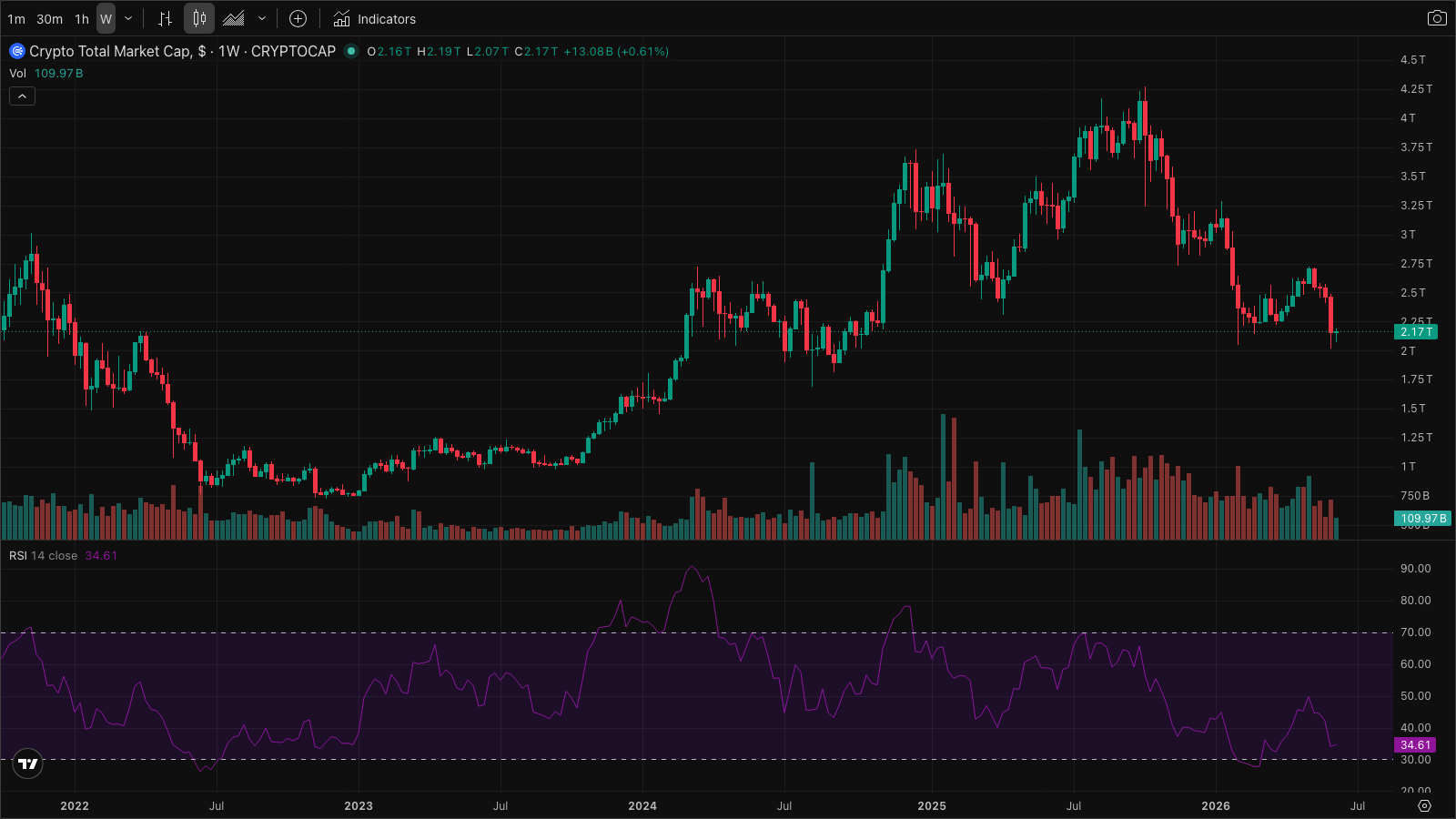
In practical 2026 terms: before Bitcoin corrected from its $126,000 all-time high, analysts identified overbought RSIs that indicated momentum had peaked. Conversely, Bitcoin’s RSI touched oversold territories in June 2026.
Source: X
Important Caveat: RSI alone does not tell you when to buy or sell. An asset can remain overbought for weeks in a strong uptrend, and oversold for weeks in a crash. So, use RSI alongside price structure and volume, never in isolation.
8. Moving Averages
Moving averages smooth out price action to reveal the underlying trend direction. The two most widely followed in crypto are the 50-day and 200-day Simple Moving Averages (SMAs).
When the 50-day SMA crosses above the 200-day SMA, it is called a Golden Cross — a bullish momentum. The reverse, when the 50-day drops below the 200-day, is the Death Cross, a bearish signal.
For shorter-term decisions, the 20 EMA (Exponential Moving Average) on the 4-hour chart is a useful dynamic level. In an uptrend, a price that repeatedly bounces off the 20 EMA is a continuation signal. In a downtrend, the same 20 EMA acts as overhead resistance where rallies tend to stall.
9. Risk Management
Chart analysis tells you where to look for opportunities. Risk management determines whether you survive long enough to act on them.
- Never risk more than 1-2% of your total capital on a single trade
- Always define your stop-loss level before you enter, not after price moves against you
- Aim for a minimum 2:1 reward-to-risk ratio: if your stop is $200 away, your target should be at least $400 away
- Avoid revenge trading after a loss. The emotional decision to “get it back quickly” destroys accounts faster than any single bad trade
- Position size to your stop-loss, not to a round number of coins
Your Crypto Chart Analysis Checklist
Use this before every trade to build a consistent, repeatable process.
Step 1: Check the daily chart. Is the overall trend up, down, or sideways? Do not fight the dominant trend.
Step 2: Identify the nearest key support and resistance levels. Mark them clearly before you do anything else.
Step 3: Look at volume. Does it confirm the trend direction, or is it diverging and raising doubts?
Step 4: Drop to the 4H chart. Does the price structure align with what the daily is showing?
Step 5: Check the RSI. Is it overbought, oversold, or showing divergence from price?
Step 6: Are moving averages stacked in the direction of the trade, or is price fighting against them?
Step 7: Look for a recognizable chart pattern at a key level that gives a clear entry trigger.
Step 8: Identify exactly where your stop-loss goes if you enter. This must be defined before entry.
Step 9: Calculate your reward-to-risk ratio. Is it at least 2:1? If not, skip the trade.
Step 10: Confirm your position size so that if the stop is hit, you lose no more than 1-2% of total capital.
Final Thought
Reading crypto charts is a skill built through repetition, not a shortcut to guaranteed profits. The traders navigating markets like 2026 where Bitcoin dropped 40%+ from its all-time high and altcoins like Solana and XRP shed even more are not the ones with the most complex setups. They are the ones who understood the trend early, respected key levels, managed their downside with discipline, and did not let emotion override their process.
Start with candlesticks. Add support and resistance. Use the checklist above on every trade. The market will do the rest of the teaching.
Disclaimer: The information presented in this article is for informational and educational purposes only. The article does not constitute financial advice or advice of any kind. Coin Edition is not responsible for any losses incurred as a result of the utilization of content, products, or services mentioned. Readers are advised to exercise caution before taking any action related to the company.


